Register Fields
As part of creating registers and forms, you’ll also be adding and reusing fields. All the fields that you create will be visible and accessible in the Register Fields tab (the ‘library’):

The Register Fields tab
Here you can:
Add New Field
To add a new field:
- Click on the Add New Field button and the Add Field dialog will display:
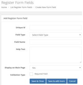
This is where you add your new register form field
You can see you need to enter the following information: Unique ID, Field Type, Field Name, Help Text, Display on Main Page, and Validation Type.
-
Add your Unique ID. This identifies your form. (We recommend picking and sticking to a naming convention– see Naming Conventions).
-
Select the Field Type from the drop-down list:
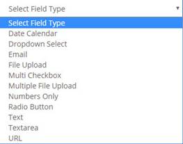
The field type drop-down list
You can select from the following field types:
- Date Calendar –insert a date picker field from which the user can select a date.
- Dropdown Select –you can create your own drop-down list containing any number of options (to add additional answer options, refer to Add Answer Options, below).
- Email – add a field where the user can insert their email address.
- File Upload – this inserts the functionality to permit the user to upload a single file.
- Multi Checkbox – this allows you to insert a number of tick checkboxes (refer to Add Answer Options, below).
- Multiple File Upload – this inserts the functionality to permit the user to upload multiple files.
- Numbers Only – a special field type, this only permits numbers to be entered.
- Radio Button – unlike a checkbox, which allows multiple boxes to be ticked/checked, a radio button allows only a single choice from the listed options (refer to Add Answer Options, below).
- Text – this inserts a small text field where you can enter a maximum of 256 characters.
- Textarea – this inserts a larger, expandable text field where you can add a larger amount of text (maximum character count TBC).
- URL – adds a field where the user can insert a web address (URL = Uniform Resource Locator).
Example
Using the Next Inspection Due date from the Plant and Equipment form as an example:
-
The first field that we need is Unique ID. It’s a date field, so using the naming convention, let’s use fdreq_dt_next_insp_due (this means, required field_date-type_field name, abbreviated).
-
Then select the Date Calendar field type
-
The Field Name is Next Inspection Due
-
The Help Text is ‘Select the date of the next inspection using the date picker’.
-
With Display on Main page, select Yes.
Display on Main Page means this field will become one of the column heading fields displayed in the master register list. For example, in the following image, the grid column headings Description, Manufacturer, Serial No., etc., are all examples of fields where Display on Main page was selected:

Fields are displayed on the main page as column headers
- This particular field is also a required field, so tick the Validation type checkbox to select it.
Over-riding the validation type field
The validation type field cannot be overridden on a per-form basis, so if it’s selected as a required field, then it will be a required field in every form that it appears in. Similarly, if it’s not a required field then it can't be a required field in some and not others.
The only way around this, at present, is to create another version of the field (1 for required and 1 for not-required fields) - so you need to have 2 different fields.
The completed field form looks like this:

How our field will look just prior to saving
- To complete the add new field either:
- Click on Save & Close to save the field, close the form, and return to the Register fields grid.
- Click on Save & Add More to save the form, close it, and display a blank form so you can add another field.
- Click on Cancel to discard changes and close the form.
Add Answer Options
Certain field types, namely, Dropdown Select, Multi Checkbox, and Radio button allow you to add multiple answers. The functionality for each is the same.
- Select the required field type and then add the Question you want to ask; or, if it’s an instruction rather than a question, the details for that field.
If you select a field type where there are different answer options, then you can add, modify, or delete the answers.
- For example, if we select a Multi Checkbox field type, then we’re presented with the following:
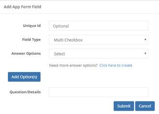
The Multi Checkbox form fields
- Assuming you’ve already added your Unique ID and the Question/Details, click on the Add Options button to add a single option. You can then repeat for the required number of options:
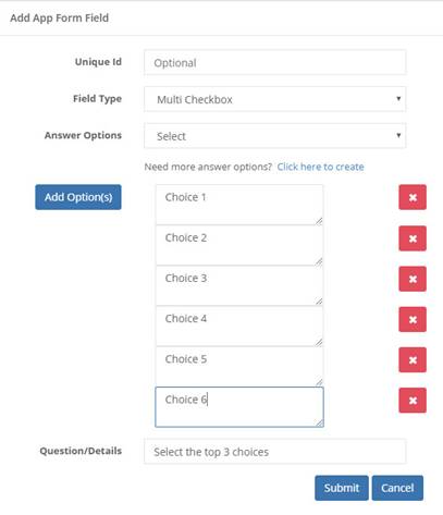
Adding multiple choices
- Add a value to each new field.
- If you need to delete an option, then click on the corresponding X button.
- When you’ve added all your options and are ready to submit the form, click on the Submit button. The form will close, and it’ll be added to the register.
- Alternatively, if you wish to discard any changes, click on Cancel. The form will close, and any changes lost.
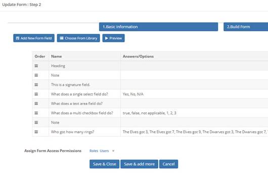
Your updated form will look similar to this
If you want to add another new field, you can either:
- Click on Add New Form Field and the dialog from before will open and you can select a new field type.
- Click on Choose From Library – we cover this in App Fields, but all fields that are created in the app are added to the library for reuse. Click on this button to open the library and where you can then select and insert an already created field.
You can click on the Preview button to see how your form currently looks.
View Field
To view the details of an existing field:
-
In the Register Fields grid, identify the field whose details you wish to view.
-
Click on the field’s name to view its attributes (right-click and select Open in a new tab if you’d prefer:
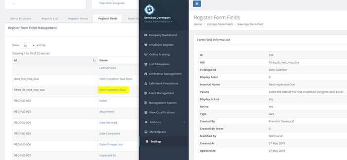
Viewing your form in a new tab
Edit Field
To edit a field:
- Identify the field in the grid
- Click on the Edit button and the field will open for editing:
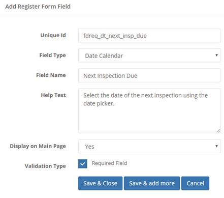
A form opened for editing
- You can now edit all aspects of the field.
- When done, click on the Save & Continue button to close the dialog and return to the field’s grid.
Delete Field
To delete a field:
- Identify the field in the field grid
- Click on the Trashcan button and the confirmation dialog will display asking you to confirm you wish to delete this field.
- Click on Yes to confirm, the dialog box will close, and the field will have been removed from the grid.
Can't delete the form?
If you can't delete the form, it's because it's in use elsewhere in the system. This is a fail-safe system rule and you’ll receive a system message informing you of this.
Search for a Field
Now we’ll search for a field
-
Click in the search field and start entering your search term.
-
For the recent example, we want to find date fields (if you recall, we used the abbreviation dt for a date field). So, enter ‘dt’ into the search field and the filter applies almost instantly:

Using the search functionality to locate a field
- This example only has a single result, but if yours returns additional results, then you can select from those.
Export Fields
The system also allows you to either export all fields or just filtered results of a search in 2 ways: csv or as an Excel spreadsheet.
- CSV – click on the csv button and the Save As dialog will open to allow you to save the file to your computer. You can now open the file and view it in the normal manner
- Excel – click on the Excel button. Again, the Save As dialog will display and allow you to save the file to your pc. You can now open the file and view it in the normal manner.
Note: when you use any of the export methods, CASSA will only select what’s on the screen, i.e. if a search filter is in place, then only those records will be selected. Delete the search text to cancel the filter and to include all fields in the export.
Print Fields
You can also send the field’s grid, filtered or unfiltered (as before), to the printer:
-
Click on Print and the print window will open.
-
You can now change the print settings, such as Destination printer, the number of pages, page orientation, etc. The actual settings all depends on your own printer.
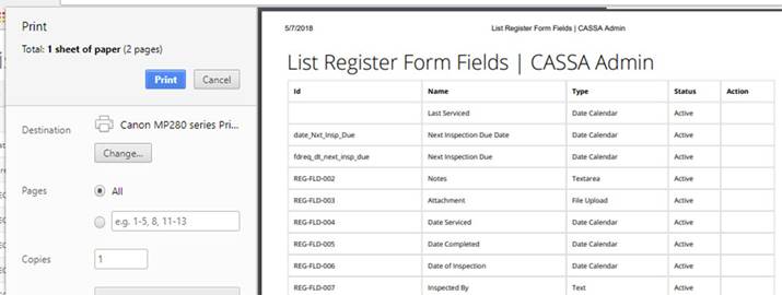
The print preview function. What you see may differ to this (depending on your printer)
- When ready, click on the Print button. The dialog box will close, and the matrix will be sent to the printer.
Updated almost 5 years ago
